
Originals and Reproductions | Japonista
Craft and Ceremony Wing · Impressions and Editions
Originals and Reproductions
版の見分け
A woodblock print is a multiple by design, so the useful question is never simply whether it is old. It is which pressing it is, who made it and what has happened to the sheet since. This chapter sets out the vocabulary of impressions, the tests that museums and scholars apply, the famous impressions of the Great Wave, the forgers who aged new colour on old paper and the collectors who made the market, and says plainly where the record falls silent.
Fact sheet
At a glance
- One block, many sheets. Ukiyo-e prints often went through multiple editions, sometimes with changes made to the blocks in later editions.
- Original pressings lead. Even high-quality later printings fetch a fraction of the valuation of an original, according to Wikipedia.
- Wear is readable. On the Great Wave, the first signs of wear are in the pink and yellow of the sky, in vanishing clouds and in broken lines around the title box.
- Intent is the difference. A reproduction and a fake can be made from the same recut blocks. The Viewing Japanese Prints teaching site says that the only difference is the maker’s intent to deceive.
- No single test decides. The same teaching site warns that some Meiji reproductions are so accurate that experts struggle to tell them apart, so every attribute should be examined before a print is ruled in or out.
A Multiple by Design
Wikipedia’s article on ukiyo-e begins its account of collecting with a sentence that governs everything after it: because the prints were mass-produced, collecting them presents considerations different from the collecting of paintings. A painting is one object. A print is a performance of a set of blocks, and the blocks could be inked and pulled again whenever a publisher judged that the public would buy more.
The article lists what varies from one sheet to the next: condition, rarity, cost and quality. A print may have stains, foxing, wormholes, tears, creases or dogmarks. The colours may have faded, or the sheet may have been retouched. When the sheet was cut after printing, the paper may have been trimmed within the margin. Carvers may also have altered the colours or composition of prints that went through multiple editions. None of these on its own condemns a sheet, and the sections below take them in turn.
The thesis of this chapter is that an original print is a matter of record before it is a matter of feeling. A good eye helps, and the later sections say what a good eye looks for. But the first question to put to any sheet is a documentary one: from which blocks, printed when, on whose authority and with what history since. The Art Institute of Chicago, in its exhibition on the connoisseurship of Japanese prints, describes the core method as comparison: lay several impressions of one design side by side and read the differences in colour, design, line definition and condition. The sections below follow that method from the vocabulary to the tests, then to the impressions of the Great Wave that the Met and other museums hold, and then to the people, honest and dishonest, who handled the sheets.

Schematic; sizes after Wikipedia
Look closer: size is shorthand, and trimming blurs it.
Diagram by Japonista. Drawn from the facts cited in this chapter; schematic, not to scale.
Two terms do most of the work. An edition is a run from the original blocks, whether the first or a later one. A recut is a new set of blocks cut to copy an earlier design. The first can be legitimate and old. The second is a different object even when it is also old, and the trade names it that way.
A note on the evidence. Where this chapter says “the article”, it means the Wikipedia article named in the text. Where it says “the teaching site”, it means viewingjapaneseprints.net, a teaching site on Japanese prints; its pages are cited below. The Met’s Open Access catalogue is quoted for every sheet shown, and the references at the foot of the page give each address. Opinion is labelled as opinion. Where a reference gives no figure, none is supplied here.
Five Rungs from Block to Copy
Reading the article’s account together, five kinds of sheet can be told apart. The first is the original pressing, printed from the first blocks soon after the design was made. The second is a later impression from the same blocks, which may show wear, or alterations made by the carver. The third is a recut edition, printed from newly cut blocks, which the article describes as including legitimate later reproductions. The fourth is a pirate edition, which the article lists among the editions that circulate beside the legitimate ones. The fifth is a fake, made to be sold as something older.
The article keeps the distinction between the third and the fifth in terms of intent. A legitimate reproduction announces itself as one. A fake does not. The difference lies in what the maker told the buyer, and no inspection of the paper replaces that record.
Condition gives a second axis, independent of the first. A first pressing can be stained and faded, and a later impression can be crisp. The article’s list of faults, which runs from foxing and wormholes to retouching and trimmed margins, is best read as a checklist for a slow look with the sheet flat on a table, turned gently to the light. Retouching is the fault that most often hides in plain sight, because a restorer’s colour is meant to be unnoticed, and a catalogue entry that names it is a sign of care, not of weakness.
The cost of the distinction is plain in the article’s own words: even high-quality later printings will fetch a fraction of the valuation of an original. The reason for care is therefore financial as well as scholarly. It also protects the print itself, because a sheet described correctly can be looked after correctly.
| Kind of sheet | Made from | What the record says |
|---|---|---|
| Original pressing | The first blocks | The reference point for value, according to Wikipedia |
| Later impression | The same blocks, reused | May show wear or carver’s changes |
| Recut edition | Newly cut blocks | Includes legitimate later reproductions |
| Pirate edition | Copied blocks | Circulates beside legitimate editions |
| Fake | Recut blocks, aged | Sold as an original |
Original, Reprint, Recut and Fake
The vocabulary matters because the trade’s words are used loosely, and a loose word is where a misunderstanding begins. The Viewing Japanese Prints teaching site defines an original as a print made during the artist’s lifetime from the earliest blocks, cut from block sketches based on the artist’s drawings. The definition includes later printings from those blocks, and it includes alternate states, in which one or more blocks were changed or replaced.
The teaching site then separates a state from an edition. A change to a block creates a different state; a change in the printing creates a different edition. A reprint, also called a restrike or reissue, is made from the original blocks at a later time, usually after the artist’s death. It may use fewer colour blocks, leave out special printing effects, use cheaper paper, or include changes to the key block. Its value, the site says, depends heavily on timing, so that a posthumous impression is worth far less than an early impression printed in the artist’s lifetime. Scholarship usually avoids the word “reprint” and speaks of early, middle and late impressions.
A recut block is different again. The site counts completely recut blocks as genuine only where the artist’s lifetime cutting replaced blocks that had been lost or damaged; it cites plugged-in actor faces and replaced courtesan heads or hairstyles as sanctioned lifetime alterations that make a different state. A pirated edition is a rare lifetime edition from completely recut blocks made without the artist’s or publisher’s permission, some of which copy the design closely and others imitate the artist’s style. It is not original to the artist, the site says, but collectors and scholars still treat it as a genuine lifetime print.
A reproduction is made from recut blocks based on an original design, and enormous numbers date from the Meiji period, 1868 to 1912, to the present. A fake is a reproduction made to deceive, often simulating the effects of age or of older pigments and papers. The University of Alabama’s guide to Japanese prints draws the same lines and gives the same verdict: the only difference between a fake and a reproduction is the maker’s intent, and the teaching site calls the difference technically that and no more. The practical consequence is that no look at the paper can replace the history of the sheet. What the maker told the first buyer is evidence that the sheet itself cannot give.
The same categories show why “original” is not a yes or no question. An impression from the first blocks printed forty years after the artist’s death is made from original blocks and is not an original in the teaching site’s sense. A lifetime impression from a recut block is an original in that sense and is not from the first blocks. The question that serves a reader is the one the Art Institute puts: which state is this, and how does it compare with the earliest known state, which the museum calls the closest to the artist’s original intent, while adding that later states are not necessarily less attractive or less valid.
| Term | Made from | When | Intent |
|---|---|---|---|
| Original | The earliest blocks, or blocks the artist sanctioned | During the artist’s lifetime | To sell the design |
| Alternate state | Original blocks with one or more changed or substituted | Often during the lifetime | To repair, correct or vary the design |
| Reprint, restrike, reissue | The original blocks, reused | Usually after the artist’s death | To sell more sheets from blocks already owned |
| Pirated edition | Completely recut blocks, without permission | During the artist’s lifetime | To profit from a popular design |
| Reproduction | Recut blocks based on an original design | Meiji period to the present | To make an honest copy |
| Fake | Recut blocks or revamped originals, aged | Any time | To deceive |
Whose Blocks Were They?
The question of who owned the blocks explains most of what follows. The teaching site states that publishers, the hanmoto or honya, owned the blocks, not the artists. The principle of zōhan, “possession of blocks”, covered copyright, ownership of the blocks and the right to publish from them. Secondary or tertiary publishers sometimes acquired blocks, a transfer the site calls kyūhan or guhan, which is how reissues came to be made by houses that had nothing to do with the first publication.
The Wikipedia article on ukiyo-e says the same thing from the other direction. Prints that went through several pressings were especially profitable because publishers could reuse the blocks without paying the artist or the carver again, and blocks were also traded or sold to other publishers or to pawnshops. A handbook chapter hosted at hiroshige.org.uk, which writes “Yedo” and so belongs to an older day, adds that publishers in the capital sold worn blocks to publishers in other towns, who recut them and printed from them after the artist’s death, and that the prints were often aged with charcoal fumes, tea stains and dirt. The handbook also reports that publishers sometimes cut out one artist’s signature and inserted a block carrying another designer’s, a join that was almost invisible.
Calendar blocks could also change names. The Wikipedia article records that the blocks of the first picture calendars, which carried the patron’s name, were later reused for commercial prints with the patron’s name replaced by the artist’s. That is a legitimate alteration, made by the publisher for a new market, and it shows that a state change is not always the work of a forger. Commerce supplied most of the variants that now puzzle collectors.
The scale of the trade is part of the story. The Wikipedia article on the Great Wave quotes the scholar Korenberg for the rule of thumb that a publisher generally had to sell at least 2,000 impressions of a design to make a profit, and adds that the number printed from a set of blocks was usually not recorded. A design that sold well was therefore pulled again and again, and the blocks wore with each pull. The first sheets carry the cleanest lines, and the last carry the marks of a block that had been used long past its prime.
Because the blocks passed from hand to hand, the margins of a print are evidence. The publisher’s seal, the date and the censor’s seal normally appear on an Edo sheet; a recut or a late reissue may carry a different publisher’s name, a different date, or none. The chapter on How a Print Was Made explains the seals in detail, and the Directory of Woodblock Print Publishers gives the marks of the houses.
Nine Tests and Their Limits
The teaching site calls the comparison of the key block lines the most important first step. Compare the endings, thickness, direction and angle of the lines, including any calligraphy, with a known original, ideally in a photographic copy. Copies usually show differences. The Alabama guide agrees and adds the caution that originals can also vary from repeated printing, so other features should be checked before a decision is made.
Colour is the second test, and the one most easily over-trusted. The teaching site says that originals often show a transparency and richness from pigment absorbed deep into the paper, and the Alabama guide adds that pigment hues changed over time, so reproduction colours often differ from the originals’. The handbook at hiroshige.org.uk calls colour the safest guide: modern colours, it says, look flat and muddy, while old prints have soft, mellow tones. The teaching site qualifies its own claim at once: the colour test, it says, is not universal and requires experience.
Paper is the third. The teaching site notes that old prints often show the design on the reverse, because the paper was absorbent, and that modern papers are typically more heavily sized, stiffer and smoother, though show-through can occur in modern prints too. The handbook’s version is the light test: held up to the light, an old print shows the whole picture from the back, while a modern print shows only patches of colour. The Alabama guide cautions that kōzo, the mulberry paper, is the most common and highly absorbent, that modern paper is usually harder and rougher, and that a soft paper does not guarantee an original, since Meiji reproductions used convincing paper. Water-lines are not proof: the handbook notes that prints as early as 1700 have them and that modern laid paper imitates them.
Cutting and printing is the fourth. Edo-period lines, the teaching site says, look more calligraphic, like brushwork, whereas modern lines are sharper with more uniform edges, though exceptions exist. The Alabama guide adds that print quality dropped with each impression as the blocks wore and the lines softened. The two statements are complementary: a faithful recut can be crisp where a late impression from the original block is tired, and the reader must be able to tell a worn original from a sharp copy.
Size is the fifth, and it is the weakest. The teaching site says that copies were generally made at the same size as the originals, so size alone rarely settles a question; the Alabama guide says that originals were published in specific traditional sizes and that deviations suggest a reproduction. The Met’s own records show how much genuine sheets of one design differ: its five catalogued impressions of Hokusai’s Red Fuji and Storm below Mount Fuji range from 24.4 to 25.7 centimetres in height and from 35.6 to 38.4 in width, all within the ōban format, as a later section shows.
The sixth is the margin inscription, and the seventh the number of colour blocks and the presence of special effects. The Meiji-recut page of the teaching site, discussed below, says that later printings from original blocks often drop a colour block or an effect such as bokashi, the colour gradation, and that a recut may replace the Edo publisher’s seals with new publishing details. The eighth is condition, where the handbook warns that freshness does not prove a recent print and that age, staining and worm-holes can all be faked. A discoloured or worm-eaten sheet should be treated with suspicion unless a clear publisher’s mark confirms it. The ninth is the likelihood of reproduction: the teaching site says that popular designs, the landscapes of Hiroshige and Hokusai, Utamaro’s women and Sharaku’s actor portraits, are copied most often.

Kitagawa Utamaro · ca. 1794 · Woodblock print; ink and color on paper
Look closer: beauties like this one are among the designs most often copied; the hair and the robe edge are the lines to compare.
Kitagawa Utamaro, "Hanazuma of Hyōgoya, Kenbishi of Sakagami” from the series The Peers of Saké Likened to Select Denizens of Six Houses (Natori zake rokkasen: Hyōgoya Hanazuma, Sakagami no Kenbishi), ca. 1794. The Metropolitan Museum of Art, Rogers Fund, 1925 (accession JP1461). Public domain, Met Open Access. Record
No test stands alone. The teaching site ends its list with the plain statement that genuine originals vary between impressions because of paper sizing, worn or warped blocks, the consistency of the colourants and the pressure of printing, and that all attributes should be examined before a print is ruled in or out. The Alabama guide says the same thing in different words: some Meiji reproductions are so accurate that experts struggle to tell them apart. The handbook’s own advice to a beginner is the shortest: if a print seems wrong and you cannot say why, discard it. A reader who prefers evidence to instinct will instead ask a specialist who has handled many sheets of the same series.
| Test | What to look for | Why it is not enough alone |
|---|---|---|
| Key-block lines | Ends, thickness, direction and angle of the lines, and any calligraphy | Originals vary from repeated printing |
| Colour | Transparency and richness from pigment absorbed into the paper | Not universal; depends on experience |
| Paper | Show-through of the design on the back; softness; light test | Meiji reproductions used convincing paper |
| Cutting and printing | Calligraphic line against sharp, uniform edges | A faithful recut can be crisp; a late impression can be tired |
| Size | Traditional sizes; deviations suggest a copy | Copies were usually made at the same size |
| Margin inscription | Publisher, date and censor seals | A recut may carry new details; a late reissue may not |
| Colour blocks and effects | Presence of every block and of bokashi | Later printings drop them; so may poor originals |
| Condition | Fading, repair, foxing, trimming | Age and wear can be faked |
| Popularity | Hiroshige, Hokusai, Utamaro and Sharaku are copied most often | Only a reason to look harder |
The Great Wave, Pressed Again
No print has been counted as closely as Hokusai’s Under the Wave off Kanagawa. Wikipedia’s article on the print states that about 1,000 copies were initially printed, resulting in wear in later editions, and that approximately 8,000 were eventually printed. As of 2022, it says, 113 original impressions of the first edition are known to survive worldwide, with the greatest proportion, 35, in American museums.
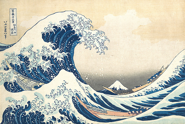
Katsushika Hokusai · ca. 1830–32 · Woodblock print; ink and color on paper
Look closer: the sky is the first part to show wear.
Katsushika Hokusai, Under the Wave off Kanagawa (Kanagawa oki nami ura), also known as The Great Wave, from the series Thirty-six Views of Mount Fuji (Fugaku sanjūrokkei), ca. 1830–32. The Metropolitan Museum of Art, H. O. Havemeyer Collection, Bequest of Mrs. H. O. Havemeyer, 1929 (accession JP1847). Public domain, Met Open Access. Record
The article also tells the reader where to look. The first signs of wear are in the pink and yellow of the sky, which fades more in worn copies. The consequences are vanishing clouds, a more uniform sky, and broken lines around the box containing the title. That is a useful lesson beyond this one design: the parts of a block that carry the finest or the shallowest cutting are the first to give way, and a careful viewer learns where those parts are before reading a price.
The Metropolitan Museum owns several impressions of the design, and the four reproduced here are the Museum’s own images. They differ in the tone of the paper and the sky, and the Museum’s records give the credit line of each. The article notes that the Museum’s copy from the Havemeyer collection was donated by Henry Osborne Havemeyer’s wife in 1929, a reminder that the provenance of a sheet is part of what it is.

Katsushika Hokusai · ca. 1830–32 · Woodblock print; ink and color on paper
Look closer: compare the paper tone and the horizon band.
Katsushika Hokusai, Under the Wave off Kanagawa (Kanagawa oki nami ura), also known as The Great Wave, from the series Thirty-six Views of Mount Fuji (Fugaku sanjūrokkei), ca. 1830–32. The Metropolitan Museum of Art, Rogers Fund, 1914 (accession JP10). Public domain, Met Open Access. Record
The comparison method is simple and slow. Lay the images side by side, as the Museum’s online records allow, and take one feature at a time: first the sky, then the cloud edges, then the title box, then the colour of the paper. Wikipedia’s article does not claim that any one sign decides a case, and neither should a reader. Each is a reason to look again, and a stack of small agreements is what makes an attribution safe.
Colour is the second thing to know. The article describes a “blue revolution” in the 1830s, in which Hokusai made extensive use of Prussian blue, a pigment it calls resistant to fading, with indigo, which it calls delicate and quickly fading. It adds that Prussian blue was imported from Holland beginning in 1820 and arrived in Japan in large quantities in 1829. A sheet’s blues, then, record both a date and a risk: the Prussian blue holds, and the indigo with it is the first to leave.
The Art Institute of Chicago adds two points that the Wikipedia article does not make. The first concerns colour: the Great Wave was traditionally printed with a bright pink sky, but most surviving copies have a pale beige sky, because light-sensitive colourants fade. The Art Institute owns three impressions, and one of them retains its pink sky. The second concerns the blocks: broken lines in the upper-left title cartouche are, the museum says, the most obvious sign that a print was made after the first state, when the blocks were worn, and light blue wave shapes on one Great Wave print come from a block added later. These two facts alone are enough to explain why the Museum’s several impressions look so different from one another.
The Wikipedia article gives the census. American museums hold the largest share of the 113 known first-edition impressions, 35 of them. The Museum of Fine Arts, Boston holds seven; the Metropolitan Museum four; the British Museum, the Art Institute of Chicago and the Tokyo National Museum three each; the Bibliothèque nationale de France, the Musée Guimet and the Ōta Memorial Museum of Art, Tokyo, two each; and the Rijksmuseum, the Victoria and Albert Museum, the Bavarian State Library, the Giverny Museum of Impressionism, the Royal Ontario Museum and the Los Angeles County Museum of Art one each. Other impressions are in private hands.
Provenance is recorded for several of them. The Metropolitan Museum’s impression came from the collection of Henry Osborne Havemeyer, and his widow gave it to the Museum in 1929. The Bibliothèque nationale de France copy came from the collection of Bing in 1888. The Musée Guimet copy is a bequest from Raymond Koechlin, who gave it in 1932. The artist Henri Rivière bought prints from Bing, from Hayashi Tadamasa and from Florine Langweil. Nineteenth-century private collectors, the article says, were frequently the origin of museum holdings of Japanese prints. A print’s path from a Paris dealer to a public museum is part of what it is.
The counts differ between accounts, and the difference is itself instructive. Wikipedia’s article gives 113 known first-edition impressions in 2022, and elsewhere says that only about a hundred prints were thought to have survived into the twenty-first century. A report on the 2025 sale, discussed in the section on prices, says that about 130 are thought to survive. These are not contradictions so much as different questions: how many are first-edition, how many are counted in museums and how many are in private hands. The same article notes that Korenberg examined 111 copies and found that 26 of them show no discernible clouds, a figure that makes a cloud a feature of some impressions rather than of every sheet.
Those who handle the sheet should also remember what the Metropolitan Museum’s essay says about the printing. The printers mixed Prussian blue with indigo for the dark outline, printed dark vertical stripes first, and printed pure Prussian blue over those stripes to fill the hollow of the wave, so that the deepest blue is a block printed twice. The Museum notes that this double printing left the deep blue areas physically lower on the paper than the single-printed medium blue, and the white paper highest, creating a subtle three-dimensional step at each colour. The Museum also records an untrimmed impression in a private New York collection that shows evidence of double printing along its lower edge. A viewer with raking light can look for the step.
The Museum’s impression, as its essay says, is “probably one of the earliest impressions” of the print. The essay does not say how that judgement was reached and the page does not claim to. What it offers is the method: the colour, the clouds, the line of the title box and the state of the paper, read together, form the case.
Red Fuji, Storm and the Width of a Sheet
The Great Wave is the best documented design, but it is not the only one for which the Museum holds several impressions. Hokusai’s South Wind, Clear Sky, which the world calls Red Fuji, is catalogued in two impressions, and Storm below Mount Fuji in three. Putting them side by side is the quickest way to learn what a genuine sheet’s variation looks like.
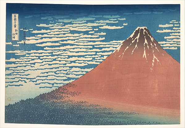
Katsushika Hokusai · ca. 1830–32 · Woodblock print; ink and color on paper
Look closer: the red mountain, the blue sky and the band of cloud: compare this sheet with the next, which is a different impression of the same design.
Katsushika Hokusai, South Wind, Clear Sky (Gaifū kaisei), also known as Red Fuji, from the series Thirty-six Views of Mount Fuji (Fugaku sanjūrokkei), ca. 1830–32. The Metropolitan Museum of Art, Rogers Fund, 1914 (accession JP9). Public domain, Met Open Access. Record
The Museum’s first Red Fuji, from the Rogers Fund of 1914, measures 24.4 by 35.6 centimetres. The second, from the bequest of Henry L. Phillips in 1939, is an ōban of 25.4 by 37.8 centimetres. The sheets differ by more than two centimetres in width, and they differ also in the depth of the blue of the sky and the tone of the paper. The Museum does not say which is earlier, and the Museum’s catalogue gives the same date range for both, about 1830 to 1832.

Katsushika Hokusai · ca. 1830–32 · Woodblock print; ink and color on paper
Look closer: a deeper blue sky and a wider sheet: two genuine impressions of one design can differ more than a casual eye expects.
Katsushika Hokusai, South Wind, Clear Sky (Gaifū kaisei), also known as Red Fuji, from the series Thirty-six Views of Mount Fuji (Fugaku sanjūrokkei), ca. 1830–32. The Metropolitan Museum of Art, Henry L. Phillips Collection, Bequest of Henry L. Phillips, 1939 (accession JP2960). Public domain, Met Open Access. Record
The three Storm below Mount Fuji sheets in the Museum measure 25.7 by 38.4, 25.4 by 37.5 and 24.8 by 37.5 centimetres. They come from three funds: the Rogers Fund of 1914, the Henry L. Phillips bequest of 1939 and the Howard Mansfield purchase of 1936. That is a spread of 0.9 centimetres in height and 0.9 in width. The Museum records the sizes and credit lines; it does not rank the three, and neither does this page. The lesson is the one the teaching site draws: copies were generally made at the same size as originals, and genuine sheets of one design vary, so measurement is a check on a decision rather than a decision.

Katsushika Hokusai · ca. 1830–32 · Woodblock print; ink and color on paper
Look closer: the lightning, the dark slope and the cloud band at the left: the three Museum sheets differ in just these places.
Katsushika Hokusai, Storm below Mount Fuji (Sanka no haku u), from the series Thirty-six Views of Mount Fuji (Fugaku sanjūrokkei), ca. 1830–32. The Metropolitan Museum of Art, Rogers Fund, 1914 (accession JP11). Public domain, Met Open Access. Record

Katsushika Hokusai · ca. 1830–32 · Woodblock print; ink and color on paper
Look closer: a second sheet from the Phillips bequest: compare the cloud band and the red of the peak with the first.
Katsushika Hokusai, Storm below Mount Fuji (Sanka no haku u), from the series Thirty-six Views of Mount Fuji (Fugaku sanjūrokkei), ca. 1830–32. The Metropolitan Museum of Art, Henry L. Phillips Collection, Bequest of Henry L. Phillips, 1939 (accession JP2961). Public domain, Met Open Access. Record
A reader who wants to practise the method has a free exercise in the Museum’s online catalogue. Open the three records of the Storm and the two of the Red Fuji and the four of the Great Wave. Take one feature at a time, as the earlier section advised: the sky, the cloud edges, the title cartouche, the tone of the paper. Note the dimensions. The point of the exercise is not to name the oldest sheet but to learn how much a single design can vary while remaining a genuine impression.
Recuts, Late Reprints and a Changed Cartouche
The Meiji period, which began in 1868, is where the question of originals becomes hard. The teaching site’s page on Meiji recuts begins with the economic fact that publishers owned the blocks and effectively held the copyright. Some, it says, kept printing from the original blocks into the Meiji period, and these late impressions show block wear and simpler colour schemes. Publishers also had blocks recut for popular designs and issued new editions. Meiji papers and pigments were close to Hiroshige’s materials, so that recuts can be hard to tell apart from originals without expertise.
The page gives one fully documented case. The blocks of Hiroshige’s One Hundred Famous Views of Edo, which the first edition of 1856 to 1858 titled Meisho Edo hyakkei, were recut in 1891 or 1892, and the margin inscription gives the date. The inscription replaces the Edo-period publisher, date and censor seals with new publishing details. The red cartouche at the upper right, which in the first edition reads Meisho Edo hyakkei, reads Senjutsu Edo shijūhakkei in the recut: the title and the number of views have changed. The recut makes limited use of brighter aniline and natural colourants, and its carving, the page says, is close to the originals in quality, so that colour and inscriptions are the main differences.

Utagawa Hiroshige · 1857 · Woodblock print; ink and color on paper
Look closer: the dark graded band across the top is the kind of gradation that, the teaching site says of the Hōeidō series, later printings often drop; the site also uses this very design to compare the early and recut editions.
Utagawa Hiroshige, Sudden Shower over Shin-Ōhashi Bridge and Atake (Ōhashi Atake no yūdachi), from the series One Hundred Famous Views of Edo (Meisho Edo hyakkei), 1857. The Metropolitan Museum of Art, The Howard Mansfield Collection, Purchase, Rogers Fund, 1936 (accession JP2522). Public domain, Met Open Access. Record
The example the teaching site uses is the very print that the Met owns, Sudden Shower over Shin-Ōhashi Bridge and Atake. The early edition, dated the ninth month of 1857, shows two boats in the distance, and the 1891 recut is the version titled Senjutsu Edo shijūhakkei. The page does not tell the reader what distinguishes the two views beyond the boats, the cartouche and the margin; the point is that an inscription and a small detail are what separate them. Without a record of the earlier edition, a reader would have no way to know that the 1891 sheet was recut at all.
A second example from the same page is a late impression from the original blocks rather than a recut: Hiroshige’s Jūmantsubo Plain at Fukagawa Susaki, which the teaching site dates to the intercalary fifth month of 1857. The early impression has crisp lines, a subtler eagle, a well-defined near shoreline and a gradated sky. The late impression has tired, worn linework, misregistered red cartouches with degraded edges, and a flat black sky showing horizontal baren marks. The Met’s catalogue dates its impression of the same design to 1856, a small discrepancy between two reputable records that is a reminder that dates in this field are inferences from the series and the seals, and that catalogues revise them.

Utagawa Hiroshige · 1856 · Woodblock print (nishiki-e); ink and color on paper; vertical ōban
Look closer: the eagle, the shoreline and the graded sky are the three details that the teaching site compares between its early and late impressions.
Utagawa Hiroshige, “Jūmantsubo Plain at Fukagawa Susaki,” from the series One Hundred Famous Views of Edo, 1856. The Metropolitan Museum of Art, The Howard Mansfield Collection, Purchase, Rogers Fund, 1936 (accession JP2520). Public domain, Met Open Access. Record
The third case is older. Hiroshige’s Tōkaidō gojūsan tsugi no uchi, the Hōeidō Tōkaidō, of about 1833 to 1834, consists of fifty-five horizontal ōban designs issued by two publishers, Takenouchi Magohachi, of the Hōeidō, and Tsuruya Kiemon, of the Senkakudō. The teaching site records that Stations 1 and 6 exist in lifetime second editions issued only by the Hōeidō, who also partly recut Station 2. Possible reasons, it says, are a fire at the Senkakudō’s shop in the second month of 1834 that may have destroyed blocks, or worn blocks recut after the Hōeidō gained sole rights. The site adds that the chronology of the many editions is still debated. Such a series shows how a lifetime recut differs in kind from a Meiji one: it was made by the first publisher or its successor, in the artist’s working years, and it counts as an alternate state.
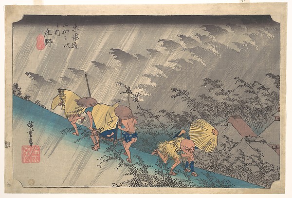
Utagawa Hiroshige · 1834–35 · Woodblock print; ink and color on paper
Look closer: the slanting rain is a pattern of grey lines in the colour blocks; later printings often drop a block or an effect.
Utagawa Hiroshige, Sudden Shower at Shōno, from the series Fifty-three Stations of the Tōkaidō, 1834–35. The Metropolitan Museum of Art, Rogers Fund, 1914 (accession JP41). Public domain, Met Open Access. Record
The Met’s early twentieth-century Hiroshige sheets, in the gallery below, show what a later printing from a Tōkaidō series looks like in a museum catalogue. Three small sheets, Miya, Seki and Fukuroi, were the gift of Cole J. Younger in 1975 and are catalogued as early twentieth century, each 17.8 by 22.9 centimetres. The Museum’s title for them is The Fifty-three Stations of the Tōkaidō Road, and its record does not say which series they belong to, so the comparison is not of one design in two states. What it shows is size and date: the Hōeidō sheet of 24.1 by 35.6 centimetres is much larger, and the Museum records the later sheets as what they are.
Borrowed Names and Crêpe Paper
Forgery is older than the Meiji recuts, and so is the habit of borrowing a famous name. The handbook at hiroshige.org.uk names its types. Reproductions are modern prints made from a new woodblock cut from an original print, or from a photographic block, the woodblock method being the usual one. Reprints are impressions from an original block pulled long after it was cut, with a coarse outline and poor colour, often in aniline dyes; some blocks were recut to match the original. Forgeries are prints in an established artist’s style bearing his signature, made either in his lifetime by a rival or after his death. Imitations are modern works in an artist’s manner.
Utamaro was widely forged, the handbook says, so that he signed some prints “the real Utamaro” when he approved them, and pupils of his school also used his signature. Shiba Kōkan, the handbook says, was the leading forger of Harunobu in Harunobu’s own lifetime. Reprints from recut Harunobu blocks, it adds, show thick lines and inferior colours. The Toyokuni name was used by at least five people. Toyokuni I died in 1825; Kunisada took the name in 1844, and Kunisada’s Toyokuni signatures are often in a cartouche, which Toyokuni I never used. Toyoshige married Toyokuni I’s widow and used the name afterwards, and Kunisada called himself the second Toyokuni and never accepted Toyoshige’s claim. A signature is evidence, but only as good as the signer.
The Wikipedia article on ukiyo-e supplies the general rule that artists sometimes changed names during their careers, and that the names signed on works can confuse; the handbook’s examples show how far confusion could be turned to profit. The handbook adds two technical points. Crêpe-paper prints appeared around 1860: the crêping process shrinks a print by about one-fifth, and damping and rolling restores its size, and many later Kunisada prints, those of his pupils and some modern reproductions were treated in this way. And prints made between 1865 and 1880 used the old technique but with crude aniline colours, which the handbook dismisses as mostly worthless, though some have sharp outlines and perfect register.
The handbook’s account of damage is a reminder that not every blemish is a forger’s work. Utamaro prints, it says, were often damaged by charcoal fumes when used as screen decorations, and, it says of its own day, Japan had few early prints left, since collectors had bought most of them. The practical point is that a sheet’s condition is a history, and a careful reader asks what the history is before deciding that a sheet is a fake.
The Man Who Aged the Ink
Wikipedia’s article records a case that every collector of the field has reason to know, and the teaching site’s page on the same man gives it more detail. Takamizawa Enji, who lived from 1870 to 1927, was a Japanese collector who employed highly skilled artisans to make facsimiles and fakes of ukiyo-e prints. His firm also produced legitimate copies of old originals, so that the name on a sheet is not in itself a mark of dishonesty. What made him notorious was a process the page calls revamping.
The method was to print colours from recut woodblocks onto faded but otherwise genuine prints. Copies were also printed with colourants and techniques meant to imitate aged originals, and the known fakes, the page says, include prints made from both recut key blocks and recut colour blocks. According to the Wikipedia article, he used tobacco ash over the new colour to make the fresh ink seem aged, and resold the refreshed prints as original printings.
Among those who bought revamped prints was the American architect Frank Lloyd Wright, who acquired them in 1919 from the Tokyo dealer Hayashi Kyūgo, who died in 1947 and was a different man from the Paris dealer Hayashi Tadamasa of a later section, and who brought about 1,500 prints from Japan to the United States that year. Some of them had already been sold to American collectors when the fraud surfaced. The teaching site names Judson Metzger, 1869 to 1956, as instrumental in recognising the fraud. The tale is told here for its proportions. A skilled maker, a plausible method and a trusting buyer were enough to place a very large number of sheets in circulation, and a distinguished eye did not prevent it.
The teaching site gives a worked example of how a revamped or copied sheet is caught. It concerns Katsukawa Shunshō’s portrait of the actor Nakamura Noshio, of about 1773, of which originals are in the Art Institute of Chicago, the Sackler Museum at Harvard and the Musée Guimet in Paris. The copies, the page says, omit the background with a round lattice window. Neither copy carries Takamizawa’s seal, so it is uncertain whether they were sold as originals, but the page attributes them to him, citing Keyes. The key block lines differ from the original’s, which is the first test. Then there is the evidence of colour: the red pigment, probably meant to simulate beni, appears faded, but the blue, probably meant to mimic aigami, is only partly faded, which is inconsistent with genuine ageing. The page adds that simulated tarnishing on the back of the mirror is common with this pink pigment.
The page ends with a caution that is as important as the case: uncommon contemporary alternate states exist, so a difference alone is not proof. The detective and the careful reader share a discipline. A single anomaly is a question; a pattern of anomalies that do not fit together, such as a faded red beside a fresh blue, is an answer. That is the sense in which the ukiyo-e specialist’s knowledge of pigments is a form of evidence.
The lesson is not that every old-looking sheet is suspect. It is that colour which looks too fresh on paper which looks too tired is a reason to ask a second question, and that the answer should come from a person who has handled many sheets of the same series.
Frank Lloyd Wright and the Revamped Prints
The architect at the centre of the Takamizawa story deserves a section of his own, because his career as a print dealer shows the trade at close range. The UCLA Hammer Museum’s account of its 2005 exhibition on Wright and the architecture of Japanese prints says that Wright first visited Japan in February 1905, at the age of 37, made a second trip in 1913 and travelled extensively from 1916 to 1922 while working on the Imperial Hotel. In the spring of 1906 he presented, at the Art Institute of Chicago, an exhibition of prints by Hiroshige from his own collection, with a catalogue. Three years later he took part in a second Art Institute exhibition as designer and lender, and in 1912 he published The Japanese Print: An Interpretation.
He also nurtured private collections, the Hammer says, for Clarence Buckingham, Frederick W. Gookin and John and William Spaulding, which later passed into museum collections across the United States, and he sold prints directly to museums. Prints repeatedly helped him through financial crises: he offered them to clients and to creditors as barter for forgiven debts. The trade was, for him, both a passion and a lifeline, and it is easy to see how a buyer who needed a supply of fine sheets could be tempted by a dealer who had them.
The Hammer’s account of the scandal is brief. In 1920 it was discovered that some prints he sold had been revamped. The methods included printing extra colours over existing ones with new blocks, using pinholes for registration, and making new impressions from original blocks. Wright blamed the Tokyo dealer Hayashi Kyūgo, whom a Japanese court sentenced to one year in prison and barred from selling prints for an extended period. The Hammer adds one more detail that colours the story: Wright himself was known to have touched up prints in his collection with coloured pencils and crayons. A reader who has followed the earlier sections will see what that means. A touched-up print is a fault of the same sort as a revamped one, even when the hand that did it is that of an honest man.
After Wright’s death, the Hammer says, the Internal Revenue Service ruled that the Frank Lloyd Wright Foundation, founded in 1940, had been wrongly designated tax-exempt, and Olgivanna Wright was forced to sell much of the art collection. The Los Angeles dealer Orrel P. Reed handled the sale of the Japanese prints, and a representative selection was shown at the Municipal Art Gallery in Barnsdall Park in January and February 1962. The Grunwald Center bought 115 prints from that show, including Katsukawa Shunshō’s Ichikawa Danjūrō, one of Wright’s favourites, and ultimately acquired more than 560 prints once owned by Wright.
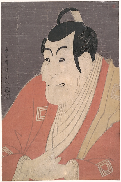
Tōshūsai Sharaku · 5th month, 1794 · Woodblock print; ink and color on paper with mica ground
Look closer: Sharaku’s actor portraits are among the designs that the teaching site says are copied most often; the mica ground of this sheet is a printing effect that the Museum records.
Tōshūsai Sharaku, Kabuki Actor Ichikawa Ebizō (Ichikawa Danjūrō V) in the play The Colored Reins of a Loving Wife (Koi nyōbō somewake tazuna), 5th month, 1794. The Metropolitan Museum of Art, Harris Brisbane Dick Fund and Rogers Fund, 1949 (accession JP3114). Public domain, Met Open Access. Record
The Collectors Who Made the Print Famous
The market for ukiyo-e outside Japan was made in the second half of the nineteenth century, and the same names recur in the provenance of famous impressions. The Wikipedia article on ukiyo-e records the earliest collectors: the Swedish naturalist Carl Peter Thunberg, who spent a year at Dejima, and the Dutch merchant Isaac Titsingh, whose collection drew the attention of Paris connoisseurs at the beginning of the nineteenth century. Ukiyo-e prints appeared in Paris from at least the 1830s and were numerous by the 1850s. Commodore Matthew Perry brought prints back to the United States after arriving in Edo in 1853, and the Convention of Kanagawa followed in 1854.
Édouard Desoye opened a store selling Japanese goods in Paris in 1862, and Japanese art drew notice at the International Exhibition of 1867. The writer Edmond de Goncourt and the art critic Philippe Burty were early European promoters, and Burty coined the term japonisme. The dealer Siegfried Bing opened his store in 1875, published the magazine Artistic Japan from 1888 to 1891 and curated an exhibition at the École des Beaux-Arts in 1890, which Mary Cassatt attended. By the end of the century, the article says, Western popularity drove prices beyond the means of most collectors, and Degas traded his own paintings for prints.
The Paris-based dealer Hayashi Tadamasa, 1853 to 1906, was a central figure. Wikipedia records that he was born in Nagasaki into a family of physicians, was adopted into a samurai family of Toyama and attended the University of Tokyo, and went to Paris in 1878 as a translator, beginning a career as a dealer in Japanese art. He wrote a Histoire de l’art du Japon in 1900, was general commissioner of the Japanese art section at the Paris World’s Fair of that year, and held sales of his collection in Paris in 1902 and 1903. A posthumous sale followed in New York in 1913. The ukiyo-e article adds that his Tokyo office evaluated and exported large quantities of prints to the West, and that Japanese critics later accused him of siphoning off a national treasure.
The Japanese side of the story is the reverse of the Western one. The article records that early on the Japanese considered woodblock prints, the most common mass medium, of little lasting value. The American Ernest Fenollosa, 1853 to 1908, who was invited to Japan in 1878 and taught at Tokyo Imperial University, was the earliest Western devotee of Japanese culture. He sold his large collection in 1886 to Charles Goddard Weld, on condition that it go to the Museum of Fine Arts, Boston, returned to Boston in 1890 as curator of Oriental art, and published Masters of Ukiyoe in 1896. In 1898, in Tokyo, he curated the first ukiyo-e exhibition in Japan.
The pattern is the one a collector should keep in mind. Museums in the United States and Europe hold many fine impressions, and part of the explanation, on the evidence above, is that nineteenth-century private collectors bought sheets in Paris and Tokyo at a time when, as the article says, the Japanese themselves thought prints of little lasting value. Provenance, the record of a sheet’s owners, is therefore a form of evidence: a print in the Bing collection by 1888, as the Bibliothèque nationale de France Great Wave was, was in circulation before the Meiji recuts and the Takamizawa revamps. Provenance cannot prove that the print is genuine, but it can place a sheet in a time and a hand.
What a Wave Fetches
The Edo-period price of a print is known only in fragments. The Wikipedia article on ukiyo-e says that prices ranged from as low as 16 mon to 100 mon for deluxe editions, against 16 mon for a bowl of soba, and that the records of hard figures are scanty. The modern valuation of a print is therefore a judgement built on rarity, reputation and state, not a continuation of the original price. The article states the consequence in a single sentence: even high-quality later printings will fetch a fraction of the valuation of an original.
The figures of recent years show how far that fraction can be from the top. On 23 March 2023, Christie’s Asia Week sale in New York sold a Great Wave impression for 2.8 million United States dollars, against a pre-sale estimate of 500,000 to 700,000, after six bidders drove the price up over thirteen minutes, according to Artnet’s report. Wikipedia adds that the print had been held by a private family since the early 1900s and had once been displayed at the Glyptotek in Copenhagen. The Artnet report notes that the earliest prints are the most coveted, with sharper lines and a subtle cloud against a pale pink sky.
In November 2025, the Wikipedia article says, a print held by the Okada Museum of Art was sold at Sotheby’s in Hong Kong for the same figure of 2.8 million dollars, and the sale resolved a debt between Kazuo Okada and Steve Wynn. My Modern Met’s report puts the price at 21.7 million Hong Kong dollars, almost three times the high estimate, calls the print a well-preserved early impression and gives the whole sale at about 88 million dollars. The report adds that about 130 impressions are thought to survive, and it names a 7.1 million dollar record that belongs to Utamaro’s Fukagawa in Snow. The reports differ in what they call a record, and the careful reader should treat the label as a headline rather than a measurement.
The sums matter less than what they imply for the reader of an ordinary sheet. Because the gap between a first impression in fine condition and a late impression is so wide, the pressure to describe a later impression as an early one is strong, and the reverse error, of dismissing a good early sheet because of an unfamiliar state, is also possible. The teaching site’s remark that value depends heavily on timing, with posthumous impressions worth far less than lifetime ones, is the counterpart of the market’s figures. A precise description, naming the state and the condition, serves both parties to a sale and protects the print.
Reproductions Made in the Open
A reproduction is not a lesser sin than a fake, but it is not a sin at all. The Viewing Japanese Prints teaching site notes that Takamizawa’s firm produced legitimate copies of old originals beside the revamps, and that a reproduction made as such is simply a reproduction. The line between the two is the one the teaching site draws: the maker’s intent. A modern workshop that cuts and prints a design in the old way, signs it as its own and sells it as a reproduction is doing what the Meiji publishers did in good faith, with better records.
The Adachi Institute of Woodcut Prints, founded in Tokyo in 1928, is the best-known case. Its pages say that it works with handmade paper from Iwano Ichibei, a Living National Treasure, from one hundred per cent paper mulberry, with blocks of wild mountain cherry and mineral and botanical pigments, and that its carvers cut the outline with a kogatana knife. The Nippon.com article on the Institute says that it has reproduced around 1,200 masterpieces. The chapter on How a Print Was Made follows the process in detail. The relevant point here is that the materials of a modern reproduction can match those of an Edo print closely, which is why the Alabama guide warns that a soft paper does not guarantee an original.
What distinguishes an honest reproduction is its description. It is sold as a reproduction, with the name of the workshop, and it commands the price of a handmade modern print, not of an Edo sheet. The University of Alabama’s guide gives the working rule: compare a doubtful print with a photographic copy of a known original, and trust a documentary history over an impression of age. A reader who buys a modern reproduction for its beauty and a first impression for its history is making two different purchases, and the same shelf can honestly hold both.
The contemporary craft also helps the reader of old prints. The Sumida Hokusai Museum, with the cooperation of the Adachi Institute, held demonstrations of the making of the Great Wave on 5 August 2023 and 20 July 2024; a visitor who has watched a printer lay colour block after colour block learns, as no book can teach, what a genuine registration and a genuine gradation look like on the table.
Handling, Light and Paper
The article is direct about what harms a sheet. The dyes are susceptible to fading when exposed even to low levels of light, which makes long-term display undesirable. The paper deteriorates in contact with acidic materials, so storage boxes, folders and mounts must be of neutral pH or alkaline. Prints should be inspected regularly for problems needing treatment, and stored at a relative humidity of 70 per cent or less to prevent fungal discolouration.
A modest set of habits follows from those sentences. Keep the sheet in a folder of neutral or alkaline material, out of the light. Look at it on a table rather than on a wall. Check it now and then. If it must hang, let it hang for a season and rest it for another. In museum settings, the article adds, display times are heavily limited to prevent deterioration from exposure to light.
Condition has its own vocabulary, and the Art Institute adds a point worth knowing: paper loss and other deterioration may be repaired, and the repairs are often detectable only by comparison with a pristine impression. Fading from light exposure is common, so that a sheet’s colour may be a record of where it hung rather than of how it was printed. The Wikipedia article on the Great Wave adds that some surviving copies are damaged by light, because Edo-period woodblock prints used light-sensitive colourants, and that the Prussian blue that Hokusai used extensively in the 1830s was resistant to fading, unlike indigo, which faded quickly. A blue that has held beside a pink that has gone is no cause for alarm; it is the expected pattern of the pigments.
A careful description therefore names what is known and what is not: the format, the condition of the colours, any repair or retouching, any trimming of the margin and the state of the impression where it can be identified. The Wikipedia article’s list of faults, from stains and foxing to wormholes, tears, creases and dogmarks, is a useful checklist for a first look. The house describes each sheet in these terms, and answers requests through the concierge. For the practice of framing and displaying, the conservation essay Framing Japanese Prints gives the detail.
Eight Short Tales of Doubt and Proof
A fake that confessed itself. In the teaching site’s case of the Shunshō actor print, the red looks faded and the blue only partly faded. Colours that age at different rates on one sheet are inconsistent with genuine ageing, and that was the forger’s mistake.
A wave that was pink. The Art Institute says that the Great Wave was traditionally printed with a bright pink sky. Of its three impressions, one still keeps it; most surviving copies are pale beige.
A name on loan. Utamaro, the handbook says, signed some prints “the real Utamaro” because so many others bore his name.
A cartouche that gave the game away. The 1891 or 1892 recut of One Hundred Famous Views of Edo changed the red title cartouche to Senjutsu Edo shijūhakkei, and printed its own date in the margin.
An architect’s pencil. Frank Lloyd Wright, who blamed a Tokyo dealer for the revamped prints he sold, was himself known to have touched up prints in his own collection with coloured pencils and crayons.
A debt paid in waves. The 2025 sale of an impression from the Okada Museum of Art resolved a debt between two private collectors, Kazuo Okada and Steve Wynn, according to Wikipedia.
Tobacco ash. Takamizawa Enji used it, the article says, to age new colour on old paper.
A cloud worth looking for. The Artnet report on the 2023 sale notes that the earliest impressions show a subtle cloud against a pale pink sky, and Korenberg’s count finds 26 of 111 copies with no discernible clouds.
Dates from the 1830s to 2025
Dates come from the references at the foot of the page. Where a reference gives only an approximate year, the approximation is shown.
| Year | Event |
|---|---|
| 1820 and 1829 | Prussian blue imported from Holland; in large quantities in Japan from 1829 |
| 1830 to 1832 | The Thirty-six Views of Mount Fuji, including the Great Wave |
| New Year 1831 | The first ten prints of the series are advertised |
| 1830s | Ukiyo-e prints appear in Paris |
| 1834 | A fire at the Senkakudō’s shop may have destroyed Hōeidō Tōkaidō blocks |
| 1853 and 1854 | Perry reaches Edo; the Convention of Kanagawa |
| 1856 to 1858 | First edition of One Hundred Famous Views of Edo |
| 1862 | Desoye opens a Japanese-goods store in Paris |
| 1864 | Aniline dyes arrive from the West |
| 1867 | Japanese art noticed at the International Exhibition in Paris |
| 1868 | The Meiji Restoration begins |
| 1870 | Takamizawa Enji is born |
| 1875 | Siegfried Bing opens his store |
| 1878 | Hayashi Tadamasa goes to Paris |
| 1886 | Fenollosa sells his collection to Charles Goddard Weld, for the Museum of Fine Arts, Boston |
| 1888 to 1891 | Bing publishes Artistic Japan |
| 1888 | The Bibliothèque nationale de France receives a Great Wave from Bing’s collection |
| 1890 | Bing’s exhibition at the École des Beaux-Arts |
| 1891 or 1892 | The blocks of One Hundred Famous Views of Edo are recut |
| 1896 | Fenollosa publishes Masters of Ukiyoe |
| 1898 | The first ukiyo-e exhibition in Japan |
| 1905 and 1906 | Wright’s first visit to Japan; his Hiroshige exhibition in Chicago |
| 1906 | Hayashi Tadamasa dies |
| 1912 | Wright publishes The Japanese Print: An Interpretation |
| 1919 and 1920 | Wright buys about 1,500 prints; the revamping is discovered |
| 1927 | Takamizawa Enji dies |
| 1929 | Mrs. Havemeyer bequeaths the Havemeyer Great Wave to the Metropolitan Museum |
| 1932 | Raymond Koechlin’s bequest to the Musée Guimet |
| 1947 | Hayashi Kyūgo dies |
| 1962 | Wright’s prints are shown in Barnsdall Park and sold |
| 2022 | 113 first-edition impressions of the Great Wave are known |
| 23 March 2023 | A Great Wave sells in New York for 2.8 million dollars |
| November 2025 | The Okada Museum of Art impression sells in Hong Kong for 2.8 million dollars |
Curiosities of the Impression
The Great Wave is an ōban sheet of 25 by 37 centimetres, and it was printed at least a thousand times.
One museum sheet of Red Fuji is more than two centimetres wider than another, though both are genuine impressions.
In the Viewing Japanese Prints taxonomy, a fake and a reproduction differ only in intent.
The Met owns four Great Wave impressions that Wikipedia counts among the 113 first-edition prints.
Fenollosa was invited to Japan in 1878 and sold his collection in 1886; the first ukiyo-e exhibition in Japan was his, in 1898.
Hayashi Kyūgo was sentenced to a year in prison by a Japanese court and barred from selling prints.
The crêping of a print shrinks it by about a fifth; damping and rolling restores the size.
A publisher had to sell at least 2,000 impressions to profit, according to Korenberg, quoted by Wikipedia.
The Grunwald Center acquired more than 560 prints once owned by Wright.
Terms Used on This Page
A vocabulary of the field, in the order in which a reader is likely to meet the words.
| Term | Meaning |
|---|---|
| Original | A print from the earliest blocks, or sanctioned blocks, in the artist’s lifetime |
| Impression | One sheet printed from a set of blocks |
| State | A version of a design in which one or more blocks has been changed |
| Edition | A run of impressions; a change of printing gives a different edition |
| Reprint, restrike, reissue | A later printing from the original blocks |
| Recut | A new block cut to copy an earlier design |
| Pirated edition | A lifetime edition from recut blocks made without permission |
| Reproduction | A copy made from recut blocks, Meiji to the present |
| Fake | A reproduction made to deceive |
| Revamping | Printing new colour from recut blocks on faded original prints |
| Hanmoto 版元 | The publisher |
| Zōhan 蔵版 | Possession of the blocks; the right to publish from them |
| Kyūhan, guhan | Blocks acquired by a later publisher |
| Key block | The block carrying the outline |
| Bokashi ぼかし | Colour gradation on the block |
| Cartouche | The panel carrying the title or series name |
| Aiban 間判 | A standard sheet of about 34.5 by 22.5 centimetres |
| Chūban 中判 | A standard sheet of about 22.5 by 19 centimetres |
| Ōban 大判 | The large standard sheet, about 25 by 37 centimetres when horizontal |
| Kōzo 楮 | Paper mulberry, the fibre of print paper |
| Aigami | Dayflower, a blue |
| Beni 紅 | Safflower red |
| Foxing | Brown spots on paper |
| Dogmark | A crease or fold in the paper |
| Provenance | The record of a sheet’s owners |
| Japonisme | The vogue for Japanese art in the West, from the 1870s |
Impressions in the Museums
Impressions of the Great Wave can be compared in the Museum’s online catalogue, in the galleries of the museums named above, and in the Art Institute of Chicago, where three impressions are held, one with its pink sky intact. The Grunwald Center at the Hammer Museum in Los Angeles has acquired more than 560 prints once owned by Wright. The Museum of Fine Arts, Boston, holds seven first-edition Great Waves, the largest number on Wikipedia’s list for any one museum, and the British Museum three. A visitor should check each museum’s pages for opening times and for what is on display, because light-sensitive prints are shown for limited periods.
For a reader at a distance, the Met’s Open Access collection lets any viewer open the records of its Great Waves, Red Fujis and Storms and take them one feature at a time. The records state the dimensions, the credit lines and the dates that are used in this chapter. The method is slow and the benefit is permanent: a reader who has compared five impressions of one design will look at the next sheet differently.
Ten Questions Before a Sheet Is Chosen
A collector may bring the chapter’s lessons to bear in ten short questions. Which design and series is it, and what is the earliest known state? Which publisher’s seal and which censor’s seal does the margin carry, and do they fit the date? Are the key block lines crisp and calligraphic, and do they match a known early impression? Is every colour block present, with its gradation? Does the paper show the design from the back, and does it look old or aged? Are the colours consistent in fading, or does a faded red sit beside a fresh blue? Is there any repair, retouching, trimming or restoration, and is it recorded? Is the size within the range for the format? What is the provenance, and does it reach back before the Meiji recuts? And finally, who is saying so, and what do they stand to gain?
The house describes each print with its format, state, colours and condition, says what is known and what is not, and answers questions through the concierge. The Glossary of Ukiyo-e Print Terms gives the vocabulary and the Directory of Woodblock Print Publishers the marks of the publishers.
Impressions, recuts and later prints

Katsushika Hokusai · ca. 1830–32 · Woodblock print; ink and color on paper
Look closer: the pale sky holds a faint cloud; compare it with the grey-brown sky of the second impression above.
Katsushika Hokusai, Under the Wave off Kanagawa (Kanagawa oki nami ura), or The Great Wave, from the series Thirty-six Views of Mount Fuji (Fugaku sanjūrokkei), ca. 1830–32. The Metropolitan Museum of Art, The Howard Mansfield Collection, Purchase, Rogers Fund, 1936 (accession JP2569). Public domain, Met Open Access. Record

Katsushika Hokusai · ca. 1830–32 · Woodblock print
Look closer: an even, cloudless sky: one of the features that the Museum’s records let a reader compare.
Katsushika Hokusai, Under the Wave off Kanagawa (Kanagawa oki nami ura), also known as The Great Wave, from the series Thirty-six Views of Mount Fuji (Fugaku sanjūrokkei), ca. 1830–32. The Metropolitan Museum of Art, Henry L. Phillips Collection, Bequest of Henry L. Phillips, 1939 (accession JP2972). Public domain, Met Open Access. Record

Katsushika Hokusai · ca. 1830–32 · Woodblock print; ink and color on paper
Look closer: a third sheet of the Storm design, the shortest of the three in the Museum’s records.
Katsushika Hokusai, Storm below Mount Fuji (Sanka no haku u), from the series Thirty-six Views of Mount Fuji (Fugaku sanjūrokkei), ca. 1830–32. The Metropolitan Museum of Art, The Howard Mansfield Collection, Purchase, Rogers Fund, 1936 (accession JP2567). Public domain, Met Open Access. Record

Utagawa Hiroshige · 1834–35 · Woodblock print; ink and color on paper
Look closer: a sheet from the Hōeidō Tōkaidō series, the series with the best documented recuts.
Utagawa Hiroshige, Spring Rain at Tsuchiyama, from the series Fifty-three Stations of the Tōkaidō, 1834–35. The Metropolitan Museum of Art, Rogers Fund, 1918 (accession JP520). Public domain, Met Open Access. Record

Utagawa Hiroshige · early 20th century · Woodblock print; ink and color on paper
Look closer: catalogued by the Museum as early twentieth century, and smaller than the ōban Hōeidō sheet beside it.
Utagawa Hiroshige, Miya, from the series The Fifty-three Stations of the Tōkaidō Road, early 20th century. The Metropolitan Museum of Art, Gift of Cole J. Younger, 1975 (accession JP3482). Public domain, Met Open Access. Record

Utagawa Hiroshige · early 20th century · Woodblock print; ink and color on paper
Look closer: another early twentieth-century sheet from the same gift: note the size, 17.8 by 22.9 centimetres.
Utagawa Hiroshige, Seki, from the series The Fifty-three Stations of the Tōkaidō Road, early 20th century. The Metropolitan Museum of Art, Gift of Cole J. Younger, 1975 (accession JP3488). Public domain, Met Open Access. Record

Utagawa Hiroshige · early 20th century · Woodblock print; ink and color on paper
Look closer: pines, a thatched teahouse and a pack horse on a horizontal sheet, catalogued as early twentieth century.
Utagawa Hiroshige, Fukuroi, from the series The Fifty-three Stations of the Tōkaidō Road, early 20th century. The Metropolitan Museum of Art, Gift of Cole J. Younger, 1975 (accession JP3472). Public domain, Met Open Access. Record

Utagawa Hiroshige · 1857 (Ansei 4), 2nd month · Woodblock print (nishiki-e); ink and color on paper
Look closer: a vertical ōban of 1857, with the dark-to-pink gradation of the sky that later printings often lose.
Utagawa Hiroshige, Plum Garden at Kamata (Kamata no umezono), from the series One Hundred Famous Views of Edo (Meisho Edo hyakkei), 1857 (Ansei 4), 2nd month. The Metropolitan Museum of Art, The Howard Mansfield Collection, Purchase, Rogers Fund, 1936 (accession JP2510). Public domain, Met Open Access. Record

Utagawa Hiroshige · 1858 · Woodblock print; ink and color on paper
Look closer: a night sky printed in graded dark tones, from the last year of the series.
Utagawa Hiroshige, Fireworks at Ryōgoku Bridge, from the series One Hundred Famous Views of Edo, 1858. The Metropolitan Museum of Art, Purchase, Joseph Pulitzer Bequest, 1918 (accession JP642). Public domain, Met Open Access. Record
The Print Shelf
Woodblock prints and printed books are gathered on one shelf, each described with its edition and condition.
Answered plainly
What is an original pressing?
A print from the first blocks, made soon after the design. Wikipedia says that even high-quality later printings will fetch a fraction of the valuation of an original.
How many Great Wave first-edition impressions survive?
As of 2022, 113 are known, with 35 in American museums, according to Wikipedia.
Where does the Great Wave wear first?
In the pink and yellow of the sky, in vanishing clouds, and in the lines around the title box.
What was Takamizawa Enji known for?
Producing reproductions, and recutting blocks to print fresh colour on faded originals, which he aged with tobacco ash.
How should a print be stored?
In neutral-pH or alkaline folders, out of the light, at 70 per cent relative humidity or less.
What is the difference between a reproduction and a fake?
Only the maker’s intent. Both are made from recut blocks; a fake is made to deceive, often by simulating age.
What is a state, and what is an edition?
A change to a block makes a different state; a change in the printing makes a different edition, according to the Viewing Japanese Prints teaching site.
What is a recut?
A new set of blocks cut to copy an earlier design. Some lifetime recuts replaced damaged blocks and count as alternate states.
Who owned the blocks?
The publisher, the hanmoto, who could reuse them, sell them on or lend them to another house.
Can a print be an original and still be a later impression?
Yes. The teaching site counts later printings from the original blocks, made in the artist’s lifetime, as originals.
How can I tell a Meiji recut from an Edo print?
By comparing the key block lines, the margin inscription and the colour. The 1891 or 1892 recut of One Hundred Famous Views of Edo changed the red cartouche to Senjutsu Edo shijūhakkei.
Does size prove an original?
No. Copies were generally made at the same size, and genuine sheets of one design vary: the Met’s three Storm below Mount Fuji sheets differ by up to 0.9 centimetres.
Does soft paper prove an original?
No. The University of Alabama guide says that a soft paper does not guarantee an original, since Meiji reproductions used convincing paper.
What is the light test?
Held up to the light, an old print shows the whole picture from the back, because its paper was absorbent, whereas a modern print shows only patches of colour, according to an older handbook.
Who was Frank Lloyd Wright in the print trade?
A collector and dealer who nurtured private collections for others and bought revamped prints in 1919; a Japanese court sentenced his Tokyo dealer to a year in prison.
How many prints did Wright bring from Japan in 1919?
About 1,500, some of which had been sold to American collectors before the fraud was recognised.
What is revamping?
Printing colour from recut blocks on faded but genuine prints, to make them look fresh.
Why did the Great Wave’s sky fade?
Edo-period woodblock prints used light-sensitive colourants. The Art Institute says that it was traditionally printed with a bright pink sky, but most copies are pale beige.
What does a broken title cartouche mean?
According to the Art Institute, broken lines in the upper-left cartouche are the most obvious sign that a print was made after the first state, when the blocks were worn.
How much has a Great Wave sold for?
Two sales of 2.8 million dollars are reported: on 23 March 2023 at Christie’s in New York, and in November 2025 at Sotheby’s in Hong Kong.
How many impressions of the Great Wave were printed?
About 1,000 at first and an estimated 8,000 in all, according to Wikipedia.
Are modern reproductions legitimate?
Yes, when described as reproductions. Takamizawa’s firm made legitimate copies, and the Adachi Institute reproduces masterpieces openly.
Where can I compare impressions?
In the Met’s Open Access catalogue, which holds four Great Waves, two Red Fujis and three Storms, and in the museums named in this chapter.
Where next
References and image credits
- Ukiyo-e, Wikipedia (Collection and preservation section)
- The Great Wave off Kanagawa, Wikipedia
- FAQ: What is an original print?, Viewing Japanese Prints
- Meiji recuts, Viewing Japanese Prints
- Takamizawa Enji, Viewing Japanese Prints
- Right or Wrong? Reproductions, University of Alabama Japanese prints guide
- Connoisseurship of Japanese Prints, Art Institute of Chicago
- Chapter 4: Forgeries, Imitations and Reprints, hiroshige.org.uk
- Wright and the Architecture of Japanese Prints, UCLA Hammer Museum
- Hayashi Tadamasa, Wikipedia
- Ernest Fenollosa, Wikipedia
- Hokusai’s Great Wave, Metropolitan Museum of Art essay
- Hokusai’s Great Wave sets a record at Christie’s, Artnet News
- Hokusai’s Great Wave sells for a record, My Modern Met
- Modern-day artisans carry on the ukiyo-e tradition, Nippon.com
- Quality of Adachi prints, Adachi Institute
- Demonstration of making the Great Wave, 20 July 2024, Sumida Hokusai Museum
- Demonstration of making the Great Wave, 5 August 2023, Sumida Hokusai Museum
- Metropolitan Museum of Art Open Access: Asian Art collection records (credited beneath each image)
Last reviewed 29 October 2026. Every photograph is public domain or openly licensed and credited beneath it; drawn diagrams are by Japonista.
Holding a print and unsure of its pressing? The concierge desk replies within one to three business days.
Private concierge
Looking for something in particular?
Describe the piece or the project you have in mind. A senior advisor in Tokyo reads every case file personally and replies within two business days, with fees set out in writing before any work begins.